Anyone care to critique my maker's mark?

Kurt Krueger

Well-Known Member
I posted this on BF too, but thought I'd broaden my audience and post here too.

I've been meaning to get to this for quite some time and this morning had the opportunity to get some help from a neighbor who works with Adobe Illustrator. I've paid attention to the comments I've seen in other "how's this maker's mark?" threads... Use your name, identify your state,,, those kinds of things. So, this is what I came up with. The knife that forms the "L" is just a rough sketch that we did in a couple of minutes, if the concept is sound, I'll tweak it to make it look a little nicer.

KruegerMakersMark17Jan15_zps4152090f.jpg


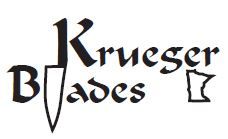
My one concern is resolution. I need it to scale down to an overall height of about 5/16" and the lines get pretty fine.

My first instinct is to get my stencils through Ernie at Blue Lightning. Are there any others that I should take into consideration?

Thanks for the help.

-Kurt
 
I like the font and the "l", looks cool. The state outline though? Not so much. There are only a handful of states that are instantly recognizable to everyone, Florida, Texas, Oklahoma, Tennessee, etc. Your local customers will "see" it, but everyone else won't. I didn't. I would also wonder how much detail of the state outline will be visible when scaled down to the actual makers mark, might leave people wondering what that little tiny box is for?

I'd like to see the finished result on a knife though, what ever you end up with. That's my 2 cents worth!
 
Last edited:
Steve if you made a bowie it would. is a cool loking design and great idea try reducing down to scale and see what gets lost and what stays.
 
Kurt, I agree with others, loose the state outline - even after looking at map I'm totally sure which state it is.... Ark?

I like the way you used the chef's knife to form the "K" and "l", what about mirroring the blade portion so the word "Blade" slides a bit more up under your name? Until I see it, not sure which I'd like best, but my compliments to you for the design. Shows creative thinking, and that will surely come thru in your knives.

edit: Yes, Ernie would be a good choice for a source of stencils.

Ken H>
 
Speaking as the full time graphic artist that I am…
One of my favorite design sayings/philosophies is:
"Less is more, more or less"
The first half is so true, the second half means that rules of thumb (& thumbs) can be broken :)

I'd lose the outline of the state… when reduced it'll get too small, too thin, and lose it's meaning.
A good logo works on a postage stamp, knife blade, truck or billboard.

Is the word "blades" really necessary on a knife?
Goes back to less is more ;)

The same for the "knife"
Once it is tiny, it'll lose it's definition…
When you use an object as a letter, or modify a letter, you have to keep the integrity of the letter so it is immediately recognizable/readable.

What letter is this?

___
___
___

E, right?
Eliminating the vertical line in an F doesn't work because there isn't enough information there to recognize it.

There is only so much one can do before the logo becomes a puzzle and not a legible or recognizable bit of information.
Really great logos become characters of their own.

Like the GE logo.
General_Electric_logo.svg


Or the Formula One logo.
formula1.jpg


Simple is better. Forget the artsy fonts. Pick one that is clear, and legible. A condensed font will fit more characters in a smaller space.
If you really want to dress it up, use the bit of art on it's own. Or use the fancy font for one initial, like the K.

Art, design, also boils down to personal taste to a degree.
Personally I abhor large, wordy maker's marks that make the knife look like a plumber's truck.
Bill Bagwell has one of the classiest marks in the business.
Nick Wheeler too. I especially like when he and Alex Daniels put their mark on the spine of the blade. Even saw one inlaid in gold.
Dozier comes to mind as well.


My advice would be to look for really good maker's marks and go from there.

Hope that helps :)
 
Thanks everybody, I especially appreciate the time and effort it takes to post a detailed response. I almost expected to get the "lose the state" feedback.

I tapped my neighbor to make a minor modification but didn't bother him with a search for an alternate font,,, house full of kids + Saturday afternoon = little spare time.

How does this version appeal?

Thanks again.

-Kurt

KruegerMakersMarkV-217Jan15_zpsfd6c7f53.jpg
 
My 2 cents is that your stylish font may bleed or not etch that well with the small tapered points of of the letters.

Like on the G B for examples. My avatar is my blade stencil. I save the stylish lettering for when I sign a document.

Name, town & State So people can read it!, was what the late Mr. Bob Loveless said when I asked him about this topic.

Regarding the Blade, If your logo is on the knife, there's a pretty good chance that folks can figure out you make knives.:3:

if you have a theme like I do with my Rhino or as Mr. Loveless had for a long time with his nude lady put that instead.
 
Last edited:
Thanks Laurence, the fine lines on some of the text is a concern of mine as well and hoped that Ernie or any other stencil maker for that matter, would be able to advise as to whether they thought it might be a problem. I wanted to pick your collective brains for general concept before sending anything out for stencil quoting, however.

As to Mr. Loveless' advice, I understand where he's coming from but I'm afraid that would likely cause more confusion in my case. I live in Wyoming, Minnesota. :3:
 
You live 150 miles from me. I drive by Wyoming every now and then.
There is nothing wrong with using just your name.
The focus should be on your knife - not your logo. And I hate the use of LOGOS on knives. Just use your name.

As far as companies to produce your stencils, I can think of no one better than IMG. The most professional people I've dealt with on the subject.

http://www.img-electromark.com/catalog/stencils/
 
I too am a fan of keeping it simple. I think it was Ed Caffrey that said to use your first name, to clarify in the event that another maker named Kruger. Maybe use the blade image as the tall leg of the K.
You only live about 45 minutes away from me. We should try to get together sometime.
 
Thanks for the input everybody!

I do have to say I'm surprised that the consensus is "just the name". The reason I tried to take some creative liberty with the mark is that, well, frankly, I'm nobody, and I thought that a little flair would stand out more memorably than "Smith" or "Jones".

I definitely will revisit the font. In hindsight, I think it is too elaborate and has detail too fine to replicate with an etch. And now that I look at it, yeah, the g does look like an s. Aw ghit!

This kind of feedback is exactly why I posted this rather than just send it off to the stencilographer.

Thanks again

-Kurt
 
I am going to suggest your first initial and last name, city and state. I seelogos all the time and some are so complicated that I seriously doubt once it is shrunk down if anyone can read it. I think if you talk to any maker their logo has gone thru a lot of changes. And in the end they usually have the simplest form that they are using at present. I have seen some that are just marks. Now I will say you kind of have to become somebody to get by with just a mark. But people are always asking can you identify this knifemaker and it is usually a symbol, a dragon, etc, etc. If you have your name and where your from its hard for someone to get it wrong later!

KISS
, A term I learned while in service, (among a few others):biggrin:. It means keep it simple stupid and no I am not calling you stupid. It has to do with being able to take something from concept to completion. The simple idea is usually the easiest to take from conception to completion!
I struggled with this when I first started making knives and after several changes I settled on this,
MakersMark_zpsdde16e70.png
My first name is Clifton but everyone calls me Cliff, Thus C Craft, The cross is a tattoo I have on my arm, the only tat that I have! I had a misguided youth and by the time I got to the Army I figured I could always use a little help with the path to the Lord!

I had Ernie make it in three different sizes and I can use it all or I can drop it down to nothing but C Craft. I toyed with making the first C slightly higher that the C in Craft and making the first C overlap the C, in Craft. I finally decided against that and opted for simple. My name is on the knife as well as where I can be contacted. KISS
 
Last edited:
I too am a fan of keeping it simple. I think it was Ed Caffrey that said to use your first name, to clarify in the event that another maker named Kruger. Maybe use the blade image as the tall leg of the K.
You only live about 45 minutes away from me. We should try to get together sometime.

After hearing the feedback to scale back to just the name, I did think about using the knife profile as the vertical leg of the K. Might just do that, haven't had time to digest all the feedback, just yet, so it's still fluid.

Western WI, hmmm, Hudson, Somerset, St. Croix Falls, New Richmond... I have work with a supplier in Somerset since about 1994, so I'm fairly familiar with the area. Small world.

-Kurt
 
KISS, A term I learned while in service, (among a few others):biggrin:. It means keep it simple stupid and no I am not calling you stupid. It has to do with being able to take something from concept to completion. The simple idea that works is usually the easiest to put to use! I struggled with this when I first started making knives and after several changes I settled on this,
MakersMark_zpsdde16e70.png
My first name is Clifton but everyone calls me Cliff, Thus C Craft, The cross is a tattoo I have on my arm, the only tat that I have! I had a misguided youth and by the time I got to the Army I figured I could always use a little help with the path to the Lord!

I had Ernie make it in three different sizes and I can use it all or I can drop it down to nothing but C Craft. I toyed with making the first C slightly higher that the C in Craft and making the first C overlap the C, in Craft. I finally decided against that and opted for simple. My name is on the knife as well as where I can be contacted. KISS

No offense at all. I'm a design engineer by trade and am a firm believer in the KISS principle, form follows function,,, Marketing never agrees!

One thing I have been wondering about is that are these "Name, City, State" guidelines still as relevant as they were when those who penned them did so? In all likelihood, that was long before the day of the internet and finding people was limited to the white or yellow pages. Information is far more available these days. Just thinkin',,, and that can be dangerous.

-Kurt
 
After hearing the feedback to scale back to just the name, I did think about using the knife profile as the vertical leg of the K. Might just do that, haven't had time to digest all the feedback, just yet, so it's still fluid.

Western WI, hmmm, Hudson, Somerset, St. Croix Falls, New Richmond... I have work with a supplier in Somerset since about 1994, so I'm fairly familiar with the area. Small world.

-Kurt


Kurt?
Lose the BLADE! They have already figured out that you are a knife maker!:34:

If you have a website you can just put the www.krugerblades.com
 
Back
Top