Help Me Choose A New Makers Mark Please!

DonL

Well-Known Member
I've posted this on two other forums and received two totally different consensus. So now I'm throwing it out to the Dogs and letting them help me decide which one I should go with. I'm working with Patricia at IMG for these new stencils. Wasn't happy with the old company. I liked the ones Tracey sold so I decided to give IMG a try.

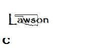
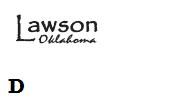
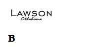
Here's the samples. I designed one myself and Patricia designed the other 3. Ignore the sizes. I blew up two of these off of her PDF, so none are to scale. I'll be ordering two different sizes, 5/8" and 3/4".
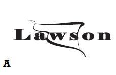
MM01_zpsa5e6b058.jpg


MMB_zps96b0c6bd.jpg


MMC_zpsc9dc1bc9.jpg


MMD_zps478327cd.jpg
 
my vote goes with D,

I would take the LAWSON letter type phont of A with out the state shape scribble, with the Oklahoma from D.

I think that would be the easiest to etch and very classy looking.

Laurence

www.rhinoknives.com
 
The layout of D with the typeface used in B
Having said that, if it were me, I wouldn't use the second face for Oklahoma.
That will get hard to read when real small.
In fact, I'd leave Oklahoma off all together.
The Lawson with the oversize L works fine on its own.

"Less is more. More or less."
 
Personally I like both B and D. D has a little more flare. But B is a more straightforward, simple design. You should factor in the types of knives you make when you decide.
 
Thank you everyone for giving me input. I appreciate the time you took. I'm leaning toward D even though C was my own design. Patricia at IMG designed the other 3. That lady is very creative! I'll probably have her change the font on the "Oklahoma" in D, because I'm concerned it may not etch well.
 
Back
Top