Let's add a few twists to the photo contest...
We are going to have some theme weeks. i.e., all the pictures have to follow a theme that week.
If we have 10 straight weeks of the same style photo's, we get one weeks experience. Let's throw in some photo challenges that make it more interesting and a learning experience for everyone....
Week 4 photo contest is about insets.
This means multiple photo's of the same knife layered into one image.
Your week 4 photo entry should be an inset. We will (attempt) to be judging on insets and how you use them.
GIMP software is free and will do an excellent job of creating a composite image so cost isn't a factor.
An inset photo has another little photo layered on top of a larger photo. Like Picture in a Picture on your TV.
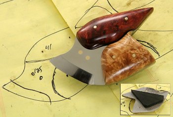
This is an example of an inset photo. In the lower right I have a small photo inserted into the big one to show the back side of the knife had a kitchen magnet...
Insets add some additional views of a knife that would otherwise not show up in a static one view picture. On the inset image below, I added a small drop shadow around the inset photo to show it off more. When I inset the smaller photo into the larger one, the yellow backgrounds blended so well the inset was lost.
An inset is an obvious additional, smaller picture inserted into a larger one. It is a deliberate technique to communicate additional views of a knife.
They are a bit harsh visually but really communicate multiple views and information in one image. An inset works well for commercial product pictures and we use them often on the supply site. There are hundreds of ways to present an inset into an image. Round, square, vignette, blur, exploded view, etc.
An inset is not a composite. See week 5 for that.
Week 5 photo contest is about composites.
This means multiple views of the same knife edited to appear like several identical knives layered into one image.
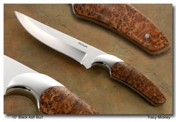
Below is a composite image. Same knife, multiple images blended into one image so it appears there are three identical knives in one image.
This image has same angle of viewing but three different focal lengths. It appears this could be done by just cropping and enlarging the same picture but this was three different images blended into one. It's a busy picture but I made it that way on purpose. I really wanted the viewer to see the wood and also how the bolster fit into it. I also spent hours hand sanding those bolsters so I was darn sure gonna show them off a little.
I tried several different variations of this and below is where I landed. The drop shadow frame is what you see most pro pictures use and really add a professional touch to a photo. In this case, since the knife had three different focal lengths, I really pushed the depth on the drop shadow frame to give a 3D look that matched the knife photo.
Your week 5 photo entry should be a composite... We will (attempt) to be judging on composites and how you use them.
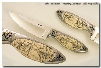
Here is another composite example. The deer scene on the front is the same scene on the back but viewed from an entirely different perspective.
Week 6 is about Staging a Photo
Your week 6 photo contest entry should have some element of staging.
Staging or dressing up your photo's is what this week's contest is about.
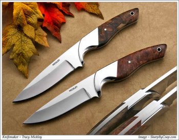
Coop took this one for me. He matched the leaf colors to the liners on the knives and the colors in the wood handle. He pushed the saturation colors in the leaves to make them nearly glow and give it some punch.
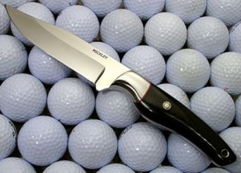
Here is a laughably bad staged picture. I spent 15 minutes just trying to hide all the golf ball logo's. I can't recall what I was going for here but I failed to achieve it.
I can tell you I live right next door to a golf course and we have golf balls landing in our yard all the time so I needed to put them to use I guess..
Week 7 Cell Phone
Use your cell phone for your week 7 photo contest entry.
Cell phones today can take good pictures if you take some time.
Let's see what you can do. I am looking to be amazed this week...
Week 8 is Black and White
Use the settings in your camera or phone or post edit with software for a Black and White image.
There are no other restrictions. Just a nice black and white image. Make Ansel Adams proud...
A couple things to look for.
Color artifacting really pops up in the white areas, especially if you post edit with sharpening.
In gray areas, it tends to get blotchy, especially if you push the contrast.
I read somewhere in a good black and white image, there should be a pure white and a pure black in the picture. I'm not sure about that but I always push at least one spot to pure black using a "levels" histogram slider. White tends to show up as blown out for me. It's a real art to put out a clean black and white with no blown out or loss areas from the full white and black range.
Weeks 9 & 10 are completely open for any technique
We are going to have some theme weeks. i.e., all the pictures have to follow a theme that week.
If we have 10 straight weeks of the same style photo's, we get one weeks experience. Let's throw in some photo challenges that make it more interesting and a learning experience for everyone....
Week 4 photo contest is about insets.
This means multiple photo's of the same knife layered into one image.
Your week 4 photo entry should be an inset. We will (attempt) to be judging on insets and how you use them.
GIMP software is free and will do an excellent job of creating a composite image so cost isn't a factor.
An inset photo has another little photo layered on top of a larger photo. Like Picture in a Picture on your TV.
This is an example of an inset photo. In the lower right I have a small photo inserted into the big one to show the back side of the knife had a kitchen magnet...
Insets add some additional views of a knife that would otherwise not show up in a static one view picture. On the inset image below, I added a small drop shadow around the inset photo to show it off more. When I inset the smaller photo into the larger one, the yellow backgrounds blended so well the inset was lost.
An inset is an obvious additional, smaller picture inserted into a larger one. It is a deliberate technique to communicate additional views of a knife.
They are a bit harsh visually but really communicate multiple views and information in one image. An inset works well for commercial product pictures and we use them often on the supply site. There are hundreds of ways to present an inset into an image. Round, square, vignette, blur, exploded view, etc.
An inset is not a composite. See week 5 for that.

Week 5 photo contest is about composites.
This means multiple views of the same knife edited to appear like several identical knives layered into one image.
Below is a composite image. Same knife, multiple images blended into one image so it appears there are three identical knives in one image.
This image has same angle of viewing but three different focal lengths. It appears this could be done by just cropping and enlarging the same picture but this was three different images blended into one. It's a busy picture but I made it that way on purpose. I really wanted the viewer to see the wood and also how the bolster fit into it. I also spent hours hand sanding those bolsters so I was darn sure gonna show them off a little.
I tried several different variations of this and below is where I landed. The drop shadow frame is what you see most pro pictures use and really add a professional touch to a photo. In this case, since the knife had three different focal lengths, I really pushed the depth on the drop shadow frame to give a 3D look that matched the knife photo.
Your week 5 photo entry should be a composite... We will (attempt) to be judging on composites and how you use them.

Here is another composite example. The deer scene on the front is the same scene on the back but viewed from an entirely different perspective.

Week 6 is about Staging a Photo
Your week 6 photo contest entry should have some element of staging.
Staging or dressing up your photo's is what this week's contest is about.
Coop took this one for me. He matched the leaf colors to the liners on the knives and the colors in the wood handle. He pushed the saturation colors in the leaves to make them nearly glow and give it some punch.

Here is a laughably bad staged picture. I spent 15 minutes just trying to hide all the golf ball logo's. I can't recall what I was going for here but I failed to achieve it.
I can tell you I live right next door to a golf course and we have golf balls landing in our yard all the time so I needed to put them to use I guess..

Week 7 Cell Phone
Use your cell phone for your week 7 photo contest entry.
Cell phones today can take good pictures if you take some time.
Let's see what you can do. I am looking to be amazed this week...
Week 8 is Black and White
Use the settings in your camera or phone or post edit with software for a Black and White image.
There are no other restrictions. Just a nice black and white image. Make Ansel Adams proud...
A couple things to look for.
Color artifacting really pops up in the white areas, especially if you post edit with sharpening.
In gray areas, it tends to get blotchy, especially if you push the contrast.
I read somewhere in a good black and white image, there should be a pure white and a pure black in the picture. I'm not sure about that but I always push at least one spot to pure black using a "levels" histogram slider. White tends to show up as blown out for me. It's a real art to put out a clean black and white with no blown out or loss areas from the full white and black range.
Weeks 9 & 10 are completely open for any technique
Last edited:
